January 14, 2008
Verification of IPCC Temperature Forecasts 1990, 1995, 2001, and 2007
Last week I began an exercise in which I sought to compare global average temperature predictions with the actual observed temperature record. With this post I’ll share my complete results.
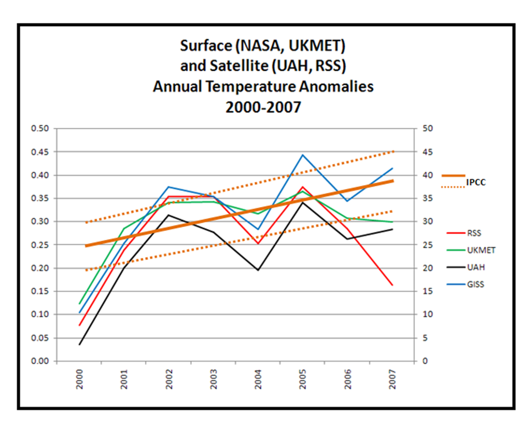
Last week I showed a comparison of the 2007 IPCC temperature forecasts (which actually began in 2000, so they were really forecasts of data that had already been observed). Here is that figure.
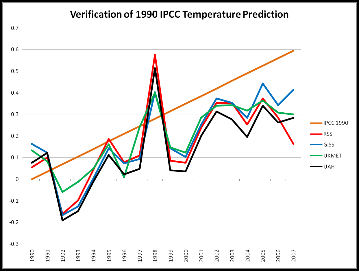
Then I showed a figure with a comparison of the 1990 predictions made by the IPCC in 1992 with actual temperature data. Some folks misinterpreted the three curves that I showed from the IPCC to be an uncertainty bound. They were not. Instead, they were forecasts conditional on different assumptions about climate sensitivity, with the middle curve showing the prediction for a 2.5 degree climate sensitivity, which is lower than scientists currently believe to the most likely value. So I have reproduced that graph below without the 1.5 and 4.5 degree climate sensitivity curves.
Now here is a similar figure for the 1995 forecast. The IPCC in 1995 dramatically lowered its global temperature predictions, primarily due to the inclusion of consideration of atmospheric aerosols, which have a cooling effect. You can see the 1995 IPCC predictions on pp. 322-323 of its Second Assessment Report. Figure 6.20 shows the dramatic reduction of temperature predictions through the inclusion of aerosols. The predictions themselves can be found in Figure 6.22, and are the values that I use in the figure below, which also use a 2.5 degree climate sensitivity, and are also based on the IS92e or IS92f scenarios.
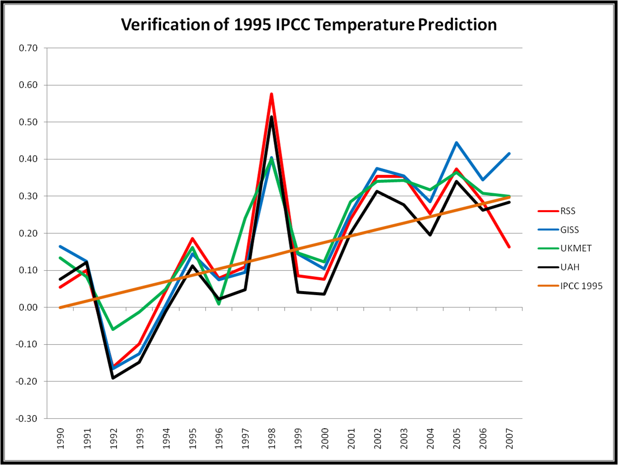
In contrast to the 1990 prediction, the 1995 prediction looks spot on. It is worth noting that the 1995 prediction began in 1990, and so includes observations that were known at the time of the prediction.
In 2001, the IPCC nudged its predictions up a small amount. The prediction is also based on a 1990 start, and can be found in the Third Assessment Report here. The most relevant scenario is A1FI, and the average climate sensitivity of the models used to generate these predictions is 2.8 degrees, which may be large enough to account for the difference between the 1995 and 2001 predictions. Here is a figure showing the 2001 forecast verification.
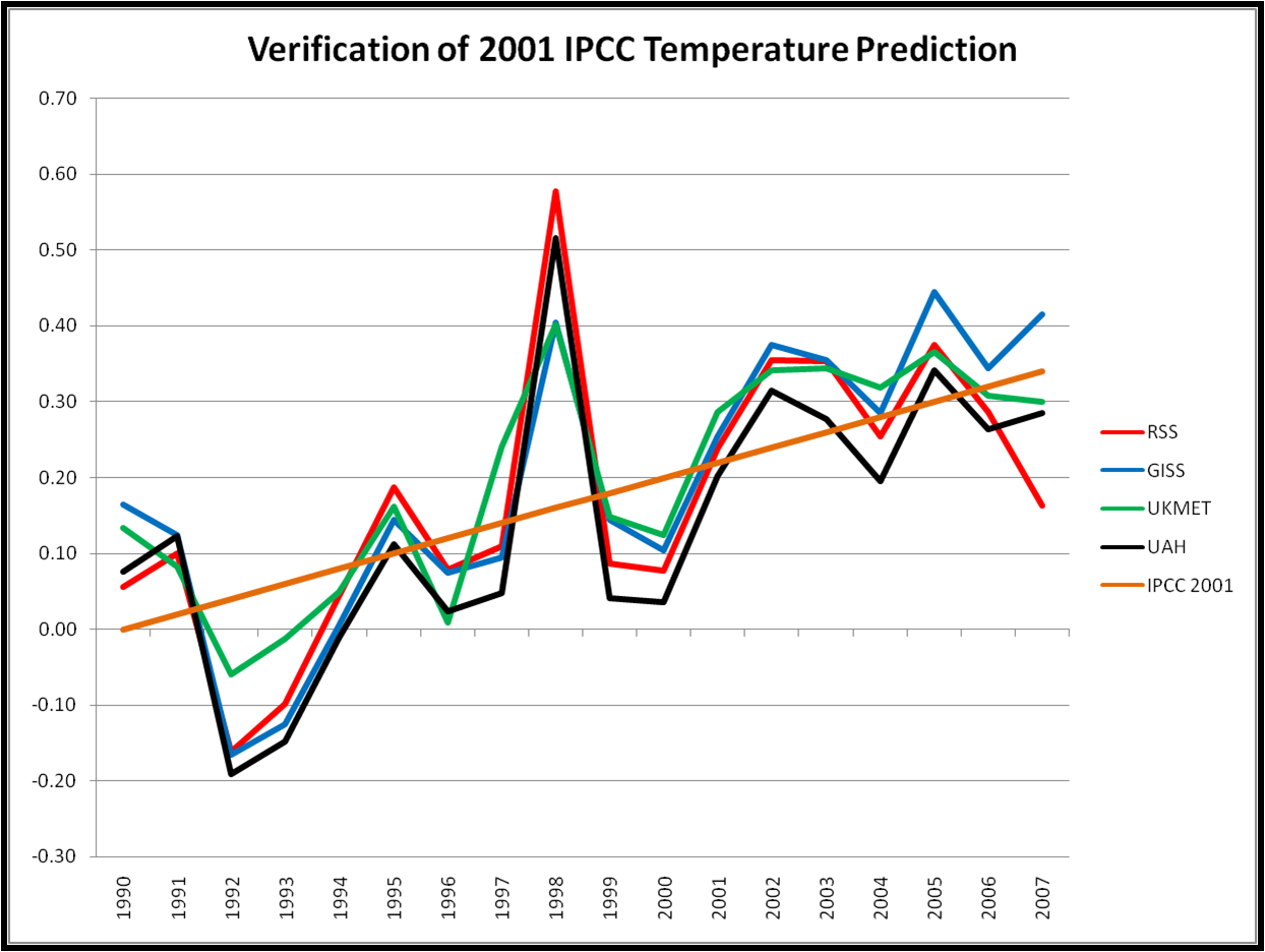
Like 1995, the 2001 figure looks quite good in comparison to the actual data.
Now we can compare all four predictions with the data, but first here are all four IPCC temperature predictions (1990, 1995, 2001, 2007) on one graph.
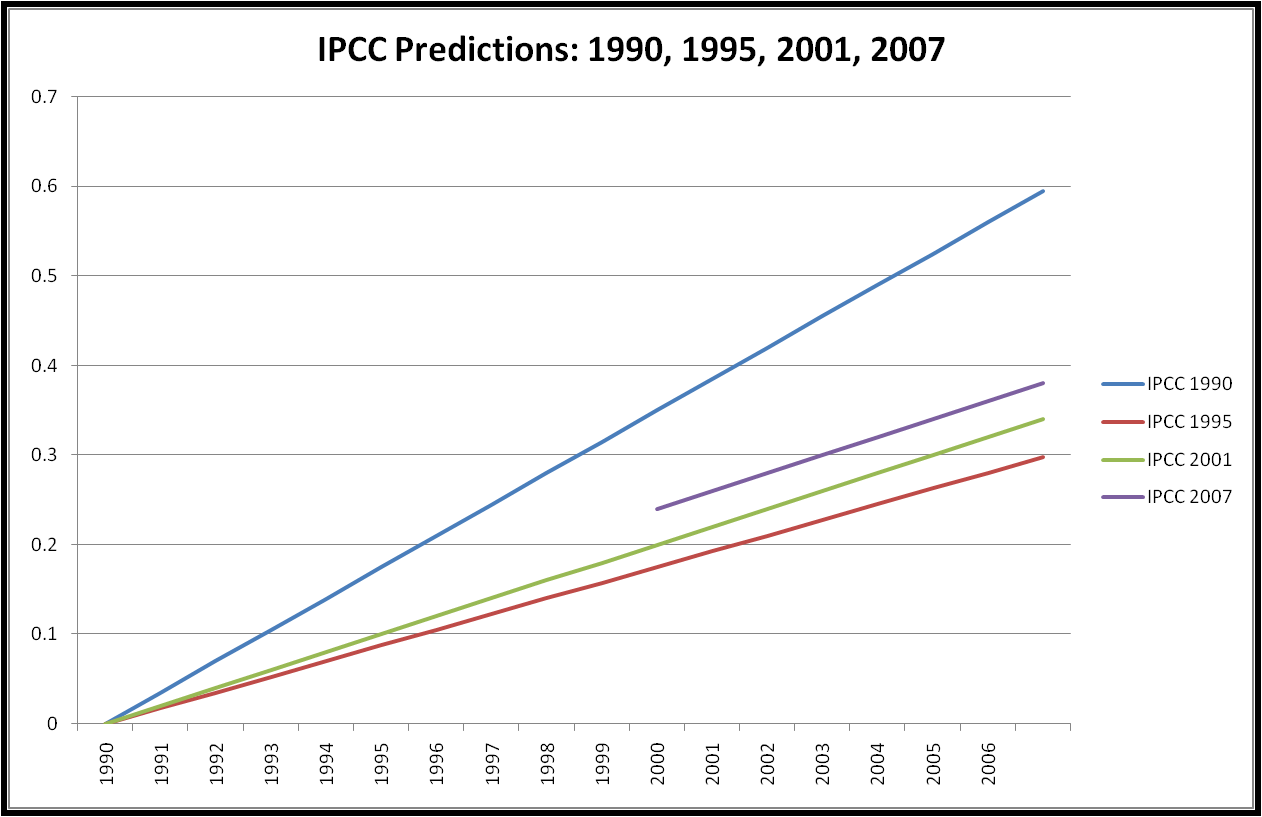
IPCC issued its first temperature prediction in 1990 (I actually use the prediction from the supplement to the 1990 report issued in 1992). Its 1995 report dramatically lowered this prediction. 2001 nudged this up a bit, and 2001 elevated the entire curve another small increment, keeping the slope the same. My hypothesis for what is going on here is that the various changes over time to the IPCC predictions reflect incrementally improved fits to observed temperature data, as more observations have come in since 1990.
In other words, the early 1990s showed how important aerosols were in the form of dramatically lowered temperatures (after Mt. Pinatubo), and immediately put the 1990 predictions well off track. So the IPCC recognized the importance of aerosols and lowered its predictions, putting the 1995 IPCC back on track with what had happened with the real climate since its earlier report. With the higher observed temperatures in the late 1990s and early 2000s the slightly increased predictions of temperature in 2001 and 2007 represented better fits with observations since 1995 (for the 2001 report) and 2001 (for the 2007 report).
Imagine if your were asked to issue a prediction for the temperature trend over next week, and you are allowed to update that prediction every 2nd day. Regardless of where you think things will eventually end up, you’d be foolish not to include what you’ve observed in producing your mid-week updates. Was this behavior by the IPCC intentional or simply the inevitable result of using a prediction start-date years before the forecast was being issued? I have no idea. But the lesson for the IPCC should be quite clear: All predictions (and projections) that it issues should begin no earlier than the year that the prediction is being made.
And now the graph that you have all been waiting for. Here is a figure showing all four IPCC predictions with the surface (NASA, UKMET) and satellite (UAH, RSS) temperature record.
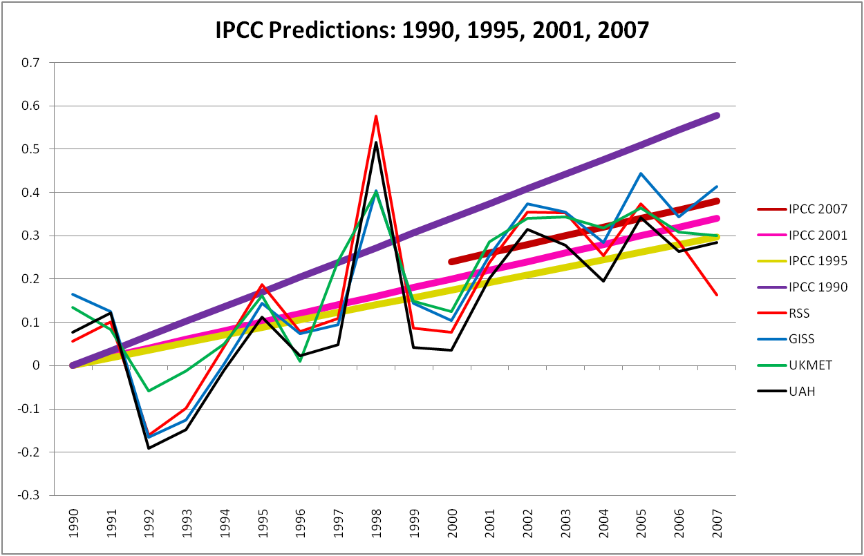
You can see on this graph that the 1990 prediction was obviously much higher than the other three, and you can also clearly see how the IPCC temperature predictions have creeped up as observations showed increasing temperatures from 1995-2005. A simple test of my hypothesis is as follows: In the next IPCC, if temperatures from 2005 to the next report fall below the 2007 IPCC prediction, then the next IPCC will lower its predictions. Similarly, if values fall above that level, then the IPCC will increase its predictions.
What to take from this exercise?
1. The IPCC does not make forecast verification an easy task. The IPCC does not clearly identify what exactly it is predicting nor the variables that can be used to verify those predictions. Like so much else in climate science this leaves evaluations of predictions subject to much ambiguity, cherrypicking, and seeing what one wants to see.
2. The IPCC actually has a pretty good track record in its predictions, especially after it dramatically reduced its 1990 prediction. This record is clouded by an appearance of post-hoc curve fitting. In each of 1995, 2001, and 2007 the changes to the IPCC predictions had the net result of improving predictive performance with observations that had already been made. This is a bit like predicting today’s weather at 6PM.
3. Because the IPCC clears the slate every 5-7 years with a new assessment report, it is guarantees that its most recent predictions can never be rigorously verified, because, as climate scientists will tell you, 5-7 years is far too short to say anything about climate predictions. Consequently, the IPCC should not predict and then move on, but pay close attention to its past predictions and examine why the succeed or fail. As new reports are issued the IPCC should go to great lengths to place its new predictions on an apples-to-apples basis with earlier predictions. The SAR did a nice job of this, more recent reports have not. A good example of how not to update predictions is the predictions of sea level rise between the TAR and AR4 which are not at all apples-to-apples.
4. Finally, and I repeat myself, the IPCC should issue predictions for the future, not the recent past.
Appendix: Checking My Work
The IPCC AR4 Technical Summary includes a figure (Figure TS.26) that shows a verification of sorts. I use that figure as a comparison to what I’ve done. Here is that figure, with a number of my annotations superimposed, and explained below.
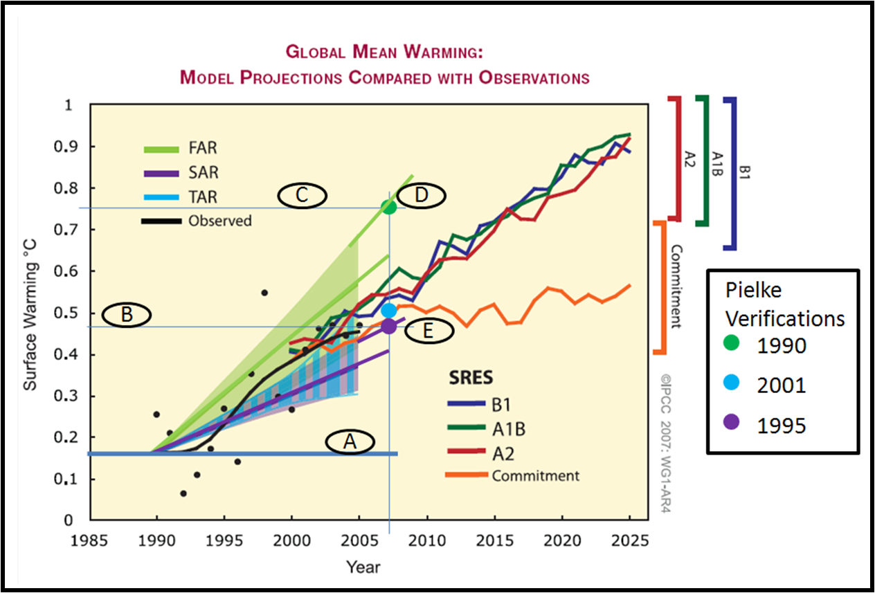
Let me first say that the IPCC probably could not have produced a more difficult-to-interpret figure (I see Gavin Schmidt at Real Climate has put out a call for help in understanding it). I have annotated it with letters and some lines and I explain them below.
A. I added this thick horizontal blue line to indicate the 1990 baseline. This line crosses a thin blue line that I placed to represent 2007.
B. This thin blue line crosses the vertical axis where my 1995 verification value lies, represented by the large purple dot.
C. This thin blue line crosses the vertical axis where my 1990 verification value lies, represented by the large green dot. (My 2001 verification is represented by the large light blue dot.)
D. You can see that my 1990 verification value falls exactly on a line extended from the upper bound of the IPCC curve. I have also extended the IPCC mid-range curve as well (note that my extension superimposed falls a tiny bit higher than it should). Why is this? I’m not sure, but one answer is that the uncertainty range presented by the IPCC represents the scenario range, but of course in the past there is no scenario uncertainty. Since emissions have fallen at the high end of the scenario space, if my interpretation is correct, then my verification is consistent with that of the IPCC.
E. For the 1995 verification, you can see that similarly my value falls exactly on a line extended from the upper end of the IPCC range. This would also be consistent with the IPCC presenting the uncertainty range as representing alternative scenarios. The light blue dot is similarly at the upper end of the blue range. What should not be missed is that the relative difference between my verifications and those of the IPCCs are just about identical.
A few commenters over at Real Climate, including Gavin Schmidt, have suggested that such figures need uncertainty bounds on them. In general, I agree, but I’d note that none of the model predictions presented by the IPCC (B1, A1B, A2, Commitment — note that all of these understate reality since emissions are following A1FI, the highest, most closely) show any model uncertainty whatsoever (nor any observational uncertainty, nor multiple measures of temperature). Surely with the vast resources available to the IPCC, they could have done a much more rigorous job of verification.
In closing, I guess I’d suggest to the IPCC that this sort of exercise should be taken up as a formal part of its work. There are many, many other variables (and relationships between variables) that might be examined in this way. And they should be.