January 10, 2008
Verification of 1990 IPCC Temperature Predictions
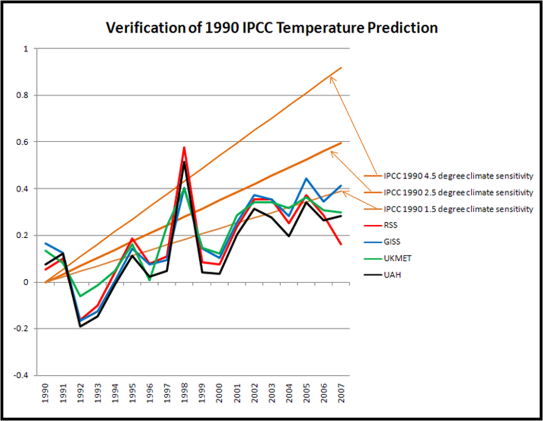
I continue to receive good suggestions and positive feedback on the verification exercise that I have been playing around with this week. Several readers have suggested that a longer view might be more appropriate. So I took a look at the IPCC’s First Assessment Report that had been sitting on my shelf, and tried to find its temperature prediction starting in 1990. I actually found what I was looking for in a follow up document: Climate Change 1992: The Supplementary Report to the IPCC Scientific Assessment (not online that I am aware of).
In conducting this type of forecast verification, one of the first things to do is to specify which emissions scenario most closely approximated what has actually happened since 1990. As we have discussed here before, emissions have been occurring at the high end of the various scenarios used by the IPCC. So in this case I have used IS92e or IS92f (the differences are too small to be relevant to this analysis), which are discussed beginning on p. 69.
With the relevant emissions scenario, I then went to the section that projected future temperatures, and found this in Figure Ax.3 on p. 174. From that I took from the graph the 100-year temperature change and converted it into an annual rate. At the time the IPCC presented estimates for climate sensitivities of 1.5 degree, 2.5 degrees, and 4.5 degrees, with 2.5 degrees identified as a “best estimate.” In the figure above I have estimated the 1.5 and 4.5 degree values based on the ratios taken from graph Ax.2, but I make no claim that they are precise. My understanding is that climate scientists today think that climate sensitivity is around 3.0 degrees, so if one were to re-do the 1990 prediction with a climate sensitivity of 3.0 the resulting curve would be a bit above the 2.5 degree curve shown above.
On the graph you will also see the now familiar temperature records from two satellite and two surface analyses. It seems pretty clear that the IPCC in 1990 over-forecast temperature increases, and this is confirmed by the most recent IPCC report (Figure TS.26), so it is not surprising.
I’ll move on to the predictions of the Second Assessment Report in a follow up.