January 26, 2012
US Emissions Projections Compared to Reduction Targets
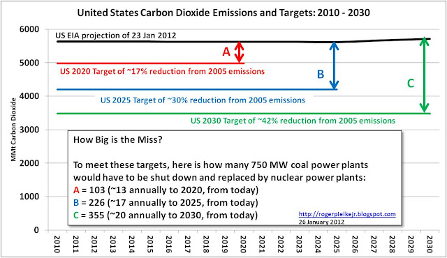
The graph at the top of this post shows the U.S. government's emissions projections (black line) and the emissions reduction targets (red, blue and green). In case you were wondering how big the misses are with respect to the targets in some sort of intuitive way, I've provided a measure of the magnitude of the shortfall (using the same methods described in depth in The Climate Fix) in terms of the number of coal power plants that would have to be replaced with nuclear power plants to meet the targets. (If you'd like to replace gas power plants, the numbers are about 40% more, due to the lower carbon intensity of gas generation. If you'd like to use wind turbines or solar power, well, get out a big calculator;-).
It should be fairly obvious that under the assumptions of the EIA (such as positive economic growth) that the emissions reduction targets are not going to be met. Given President Obama's renewed commitment to an "all of the above" strategy for energy production in the United States, is it finally time to dismiss the charade of emissions reductions targets and adopt a different approach?