May 23, 2008
Homework Assignment: Solve if you Dare
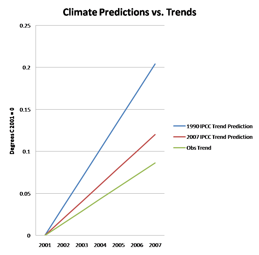
The graph above shows three trend lines.
BLUE: Temperature Trend prediction from the 1990 IPCC report
RED: Temperature Trend prediction from the 2007 IPCC report
GREEN: Observed Trend for 2001-2007 (from average of four obs datasets)
All data is as described in this correspodence (PDF).
Your assignment:
Which IPCC prediction is the trend observed 2001-2007 more consistent with and why? Show your work!
You are free to bring in whatever information and use whatever analysis that you want.