January 16, 2008
UKMET Short Term Global Temperature Forecast
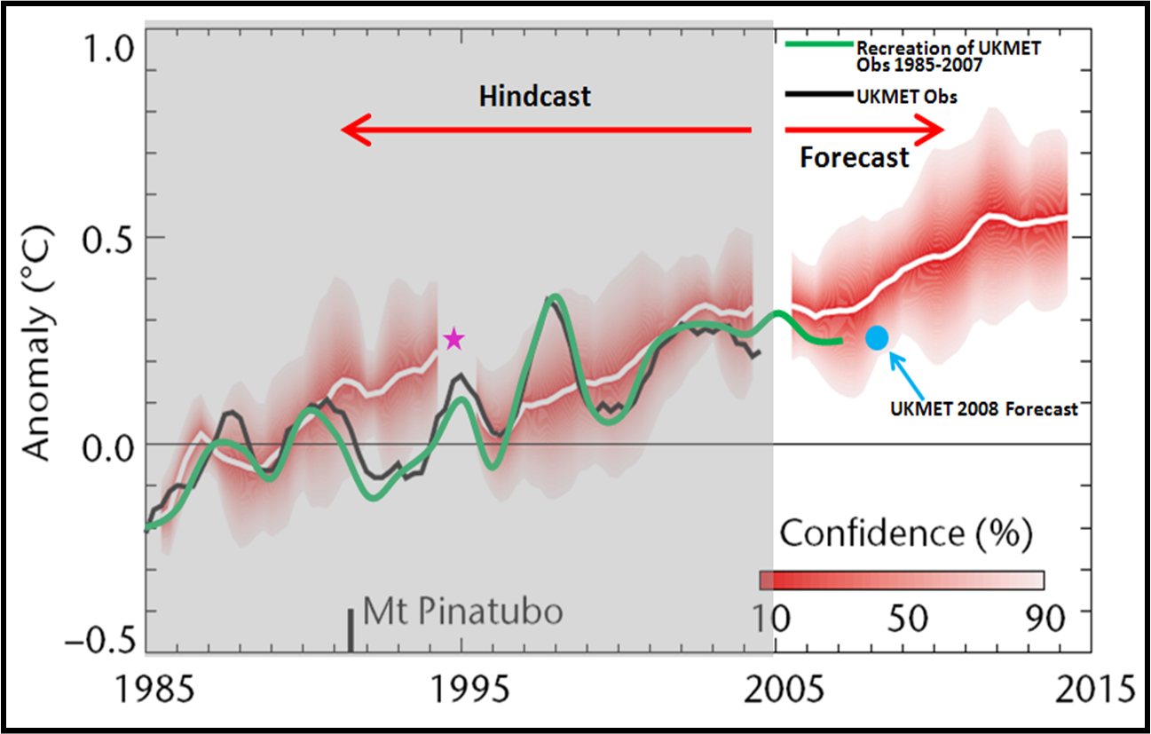
This figure shows a short-term forecast of global average temperature issued by the UK Meteorological Service, with some annotations that I’ve added and described below. The forecast is discussed in this PDF where you can find the original figure. This sort of forecast should be applauded, because it allows for learning based on experience. Such forecasts, whether eventually shown to be wrong or right, can serve as powerful tests of knowledge and predictive skill. The UK Met Service is to be applauded. Now on to the figure itself.
The figure is accompanied by this caption:
Observations of global average temperature (black line) compared with decadal ‘hindcasts’ (10-year model simulations of the past, white lines and red shading), plus the first decadal prediction
for the 10 years from 2005. Temperatures are plotted as anomalies (relative to 1979–2001). As with short-term weather forecasts there remains some uncertainty in our predictions of temperature over a decade. The red shading shows our confidence in predictions of temperature in any given year. If there are no volcanic eruptions
during the forecast period, there is a 90% likelihood of the temperature being within the shaded area.
The figure shows both hindcasts and a forecast. I’ve shaded the hindcasts in grey. I’ve added the green curve which is my replication of the global temperature anomalies from the UKMET HADCRUT3 dataset extended to 2007. I’ve also plotted as a blue dot the prediction issued by UKMET for 2008, which is expected to be indistinguishable from the temperature of years 2001 to 2007 (which were indistinguishable from each other). The magnitude of the UKMET forecast over the next decade is almost exactly identical to the IPCC AR4 prediction over the same time period, which I discussed last week.
I have added the pink star at 1995 to highlight the advantages offered by hindcasting. Imagine if the model realization begun in 1985 had been continued beyond 1995, rather than being re-run after 1995. Clearly, all subsequent observed temperatures would have been well below that 1985 curve. One important reason for this is of course the eruption of Mt. Pinatubo, which was not predicted. And that is precisely the point — prediction is really hard, especially when conducted in the context of open systems, and as is often said, especially about the the future. Our ability to explain why a prediction was wrong does not make that prediction right, and this is a point often lost in debate about climate change.
Again, kudos to the UK Met Service. They’ve had the fortitude to issue a short term prediction related to climate change. Other scientific bodies should follow this lead. It is good for science, and good for the use of science in decision making.